The Unsung Hero of Responsive Design: The 8px Grid
In the constantly changing field of web design, where styles and fashions come and go, one aspect remains unchanging: the grid system. This unseen structure, made up of a network of horizontal and vertical lines, may seem like a technical detail, but it’s actually the basis for creating a successful, responsive website.
Let’s delve into why grids are the unsung hero of responsive design and explore the industry-standard 8pt grid system and the benefits of using scales of 8.
The Power of Structure
Imagine a website that looks amazing on your desktop but becomes a jumbled mess on your phone. That’s the danger of neglecting a grid system. Grids provide a framework for organising content, ensuring a consistent and visually pleasing layout across all devices. They act like a blueprint, guiding the placement of elements like text, images, and buttons. This consistency fosters a sense of order and professionalism, keeping users engaged and navigating with ease.
The Magic of 8: Why the 8px Grid Reigns Supreme
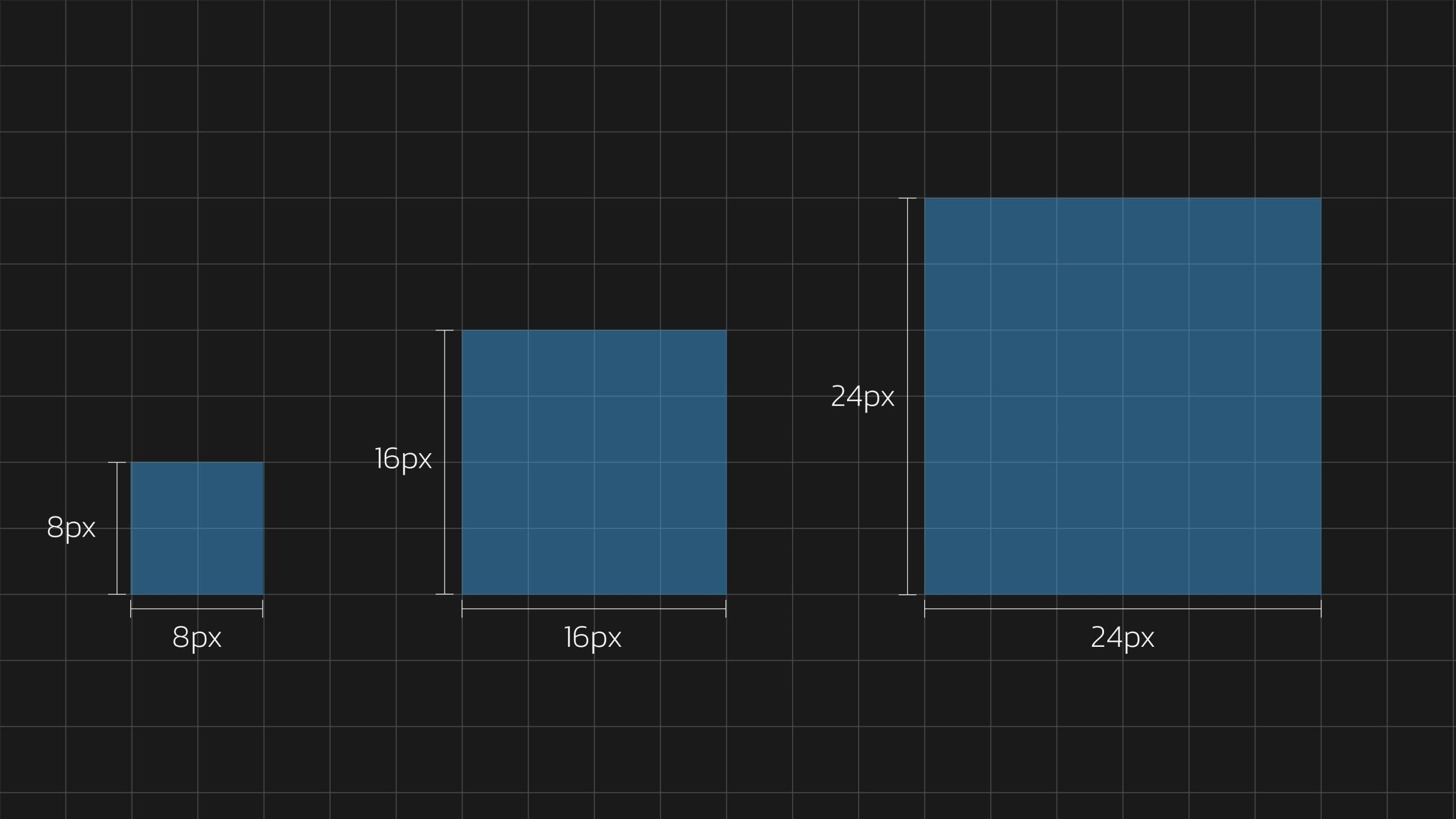
The 8pt grid system has become an industry standard for a reason. It uses a baseline grid with 8px increments, making it incredibly flexible. This allows for easy scaling of elements while maintaining a sense of balance. Consider it a modular system where elements snap into place, ensuring a harmonious composition.

The Symphony of Scales: Benefits of Using 8
The beauty of the 8px grid lies in its harmonious relationship with the number 8 itself. Here’s how scales of 8 elevate your design:
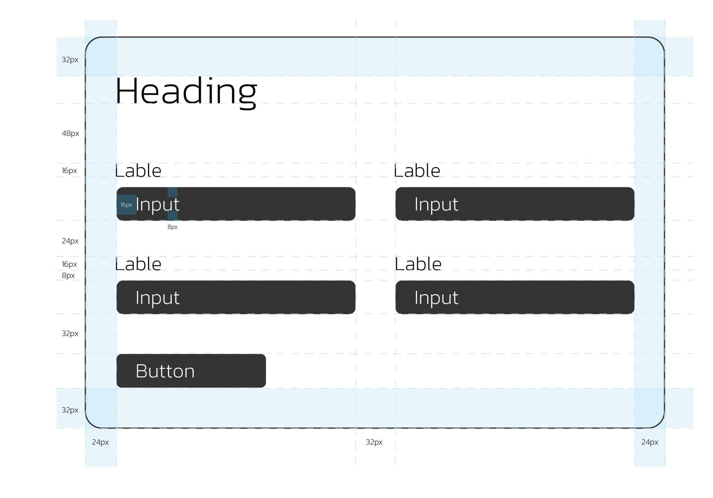
- Predictability: By using multiples of 8 for element widths, margins, and padding, you create a predictable rhythm in your layout. This predictability translates to a more intuitive user experience.
- Efficiency: The modular nature of the 8px grid allows for faster prototyping and development. Designers can create layouts with a clear understanding of how elements will interact and resize.
- A Familiar Friend: The 8pt grid system is widely used in design software such as Figma (and those still using XD), so there’s a good chance you’re already comfortable working with it. This familiarity translates to a smoother and more efficient design workflow.
- Responsiveness: The 8px grid’s flexibility shines in responsive design. As screen sizes change, elements can be adjusted in increments of 8, ensuring a seamless transition across devices.
- Visual Hierarchy: The grid system helps establish visual hierarchy by defining the relative importance of content. Larger elements naturally grab attention, guiding the user’s eye through the website.
Grids: The Secret Weapon for Responsive Design Success
Grids may not be the flashiest design element, but their impact is undeniable. By adopting the 8px grid system and embracing scales of 8, you’ll be well on your way to crafting responsive websites that are visually appealing, user-friendly and efficient to build. So, the next time you start a web design project, remember the power of the humble grid – the invisible hero will make your website a responsive masterpiece.
Are you looking to supercharge your website?
Drop us a line. We’re here to help elevate your website and generate more leads for your business.
