Colour Theory in Graphic Design
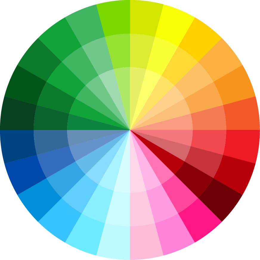
Colours play a significant role in our lives, impacting our emotions, behaviours, and decisions. Similarly, colours hold a lot of power in communicating messages and creating compelling designs. Let’s explore the psychological impact of colour theory in graphic design and how it affects us.
Red:
Red is a powerful and intense colour that can evoke a range of emotions, including passion, love, anger, and danger. It’s commonly used to grab attention, create urgency, and stimulate appetite. Brands like Coca-Cola, KFC, and Meatbox use red in their logos to create a sense of excitement and energy.

Blue:
Blue is a calming and soothing colour that represents trust, confidence, and stability. It’s often used in corporate branding to convey professionalism and reliability. Brands like IBM, Facebook, and Pointers Financial use blue in their logos to create a sense of trustworthiness and dependability.

Yellow:
Yellow is a cheerful and optimistic colour representing happiness, warmth, and positivity. It’s commonly used to draw attention and create a sense of playfulness. Brands like McDonald’s, Best Buy, and Nikon use yellow in their logos to create a sense of joy and happiness.

Green:
Green is a natural and calming colour representing growth, harmony, and balance. It’s often used in environmental and health-related branding to convey a sense of well-being and sustainability. Brands like Whole Foods, Starbucks, and Animal Planet use green in their logos to create a sense of eco-friendliness and vitality.

Purple:
Purple is a luxurious and creative colour representing royalty, spirituality, and imagination. It’s often used in beauty and fashion branding to convey a sense of elegance and sophistication. Brands like Cadbury, Hallmark, and Yahoo! use purple in their logos to create a sense of creativity and innovation.

Orange:
Orange is vibrant and energetic, symbolising friendliness, enthusiasm, and affordability. It’s commonly used in food and beverage branding to create a sense of appetite and affordability. Brands like Fanta, Harley Davidson, and Easyjet use orange in their logos to create a sense of fun and excitement.

In conclusion, colour theory is essential in graphic design, as it’s used to communicate messages, evoke emotions, and create influential designs. By understanding the psychological impact of colours, designers can create designs that resonate with their target audience and create a lasting impression. So, the next time you see a logo or a design, pay attention to the colours used and how they make you feel.
Looking to inject colour and life into your brand and business? Drop us a line; we would love to work with you.

