Bell Jar Books
Logo design
Created by author Helen Steadman, Bell Jar Books is a new publishing house focusing on Historical Fiction.
After writing three books under a different publishing house, Helen wanted to take back full control of her titles and bought back the publishing rights.
the process
We were tasked to design a new logo and colophon for Helen to use on her books and other branded material.
With a real passion for historical fiction and literature, Helen came up with the name ‘Bell Jar Books’ for her publishing house – which is a little nod to one of her favourite authors – Sylvia Plath and her book The Bell Jar.
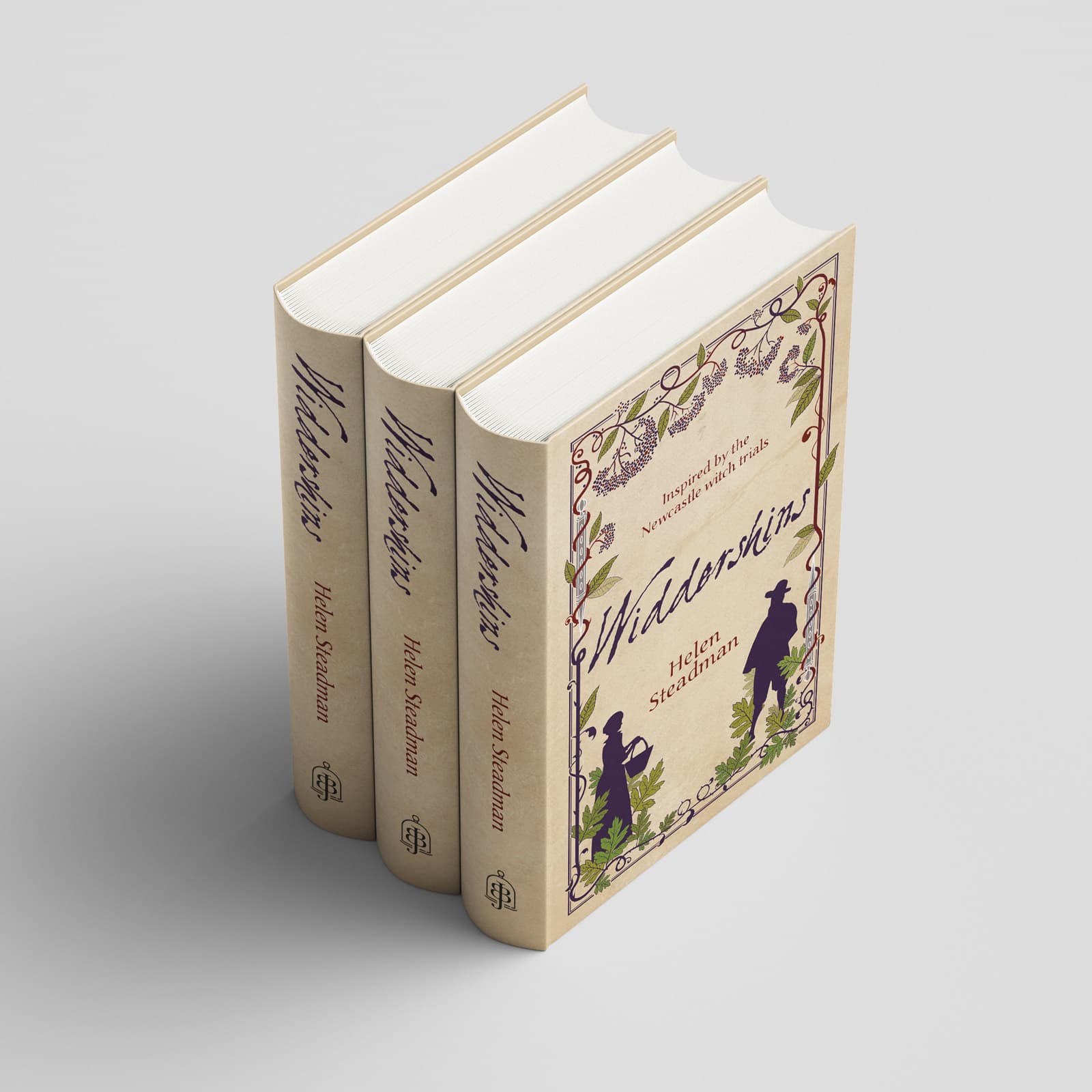
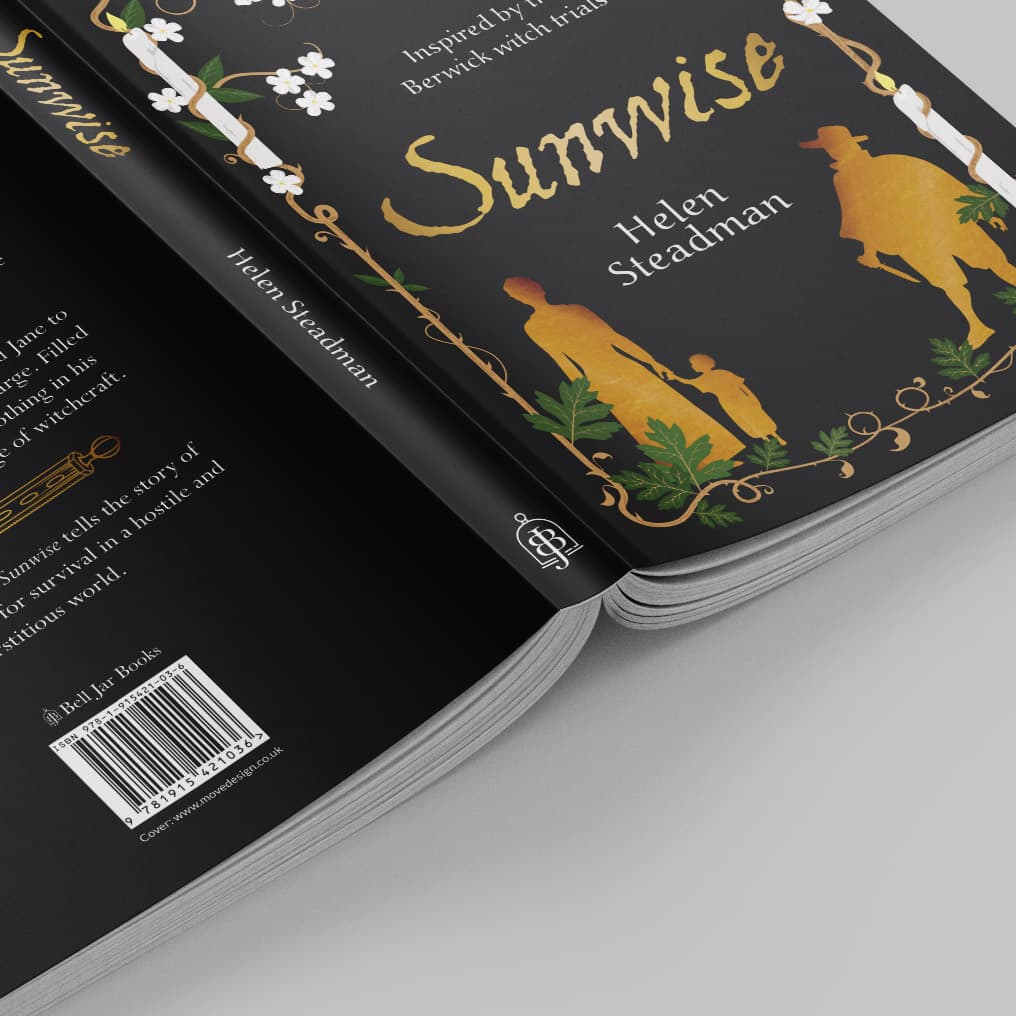
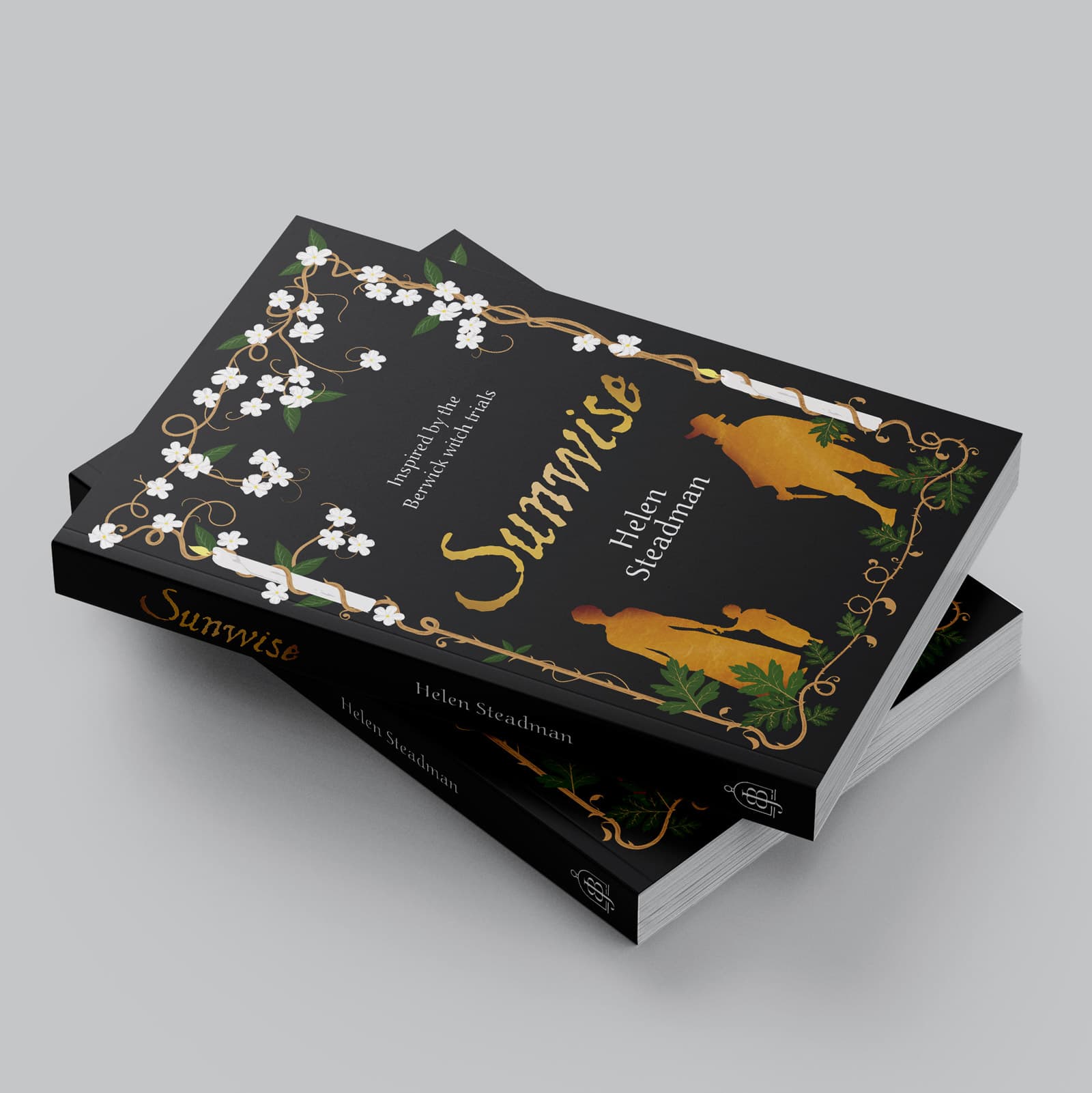
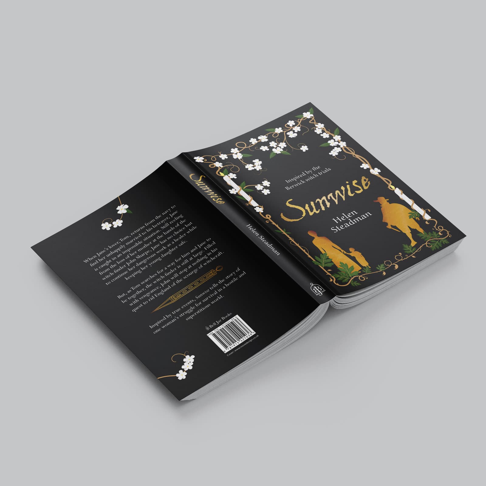
For the colophon icon, Helen wanted a representation of a dragonfly which was made up of the letters BJB.
In order for the colophon to be legible on different spine widths, we had to produce a number of scale tests of the logo to make sure it did not lose detail at smaller sizes.
After a few iterations, the finalised icon was kept simple, clean and could stand the test of time.
For the typeface we opted for Baskerville, a classic font used within literature. This serif also helps to give the appearance Bell Jar Books is well established.

