Pointers Financial
Branding and Identity
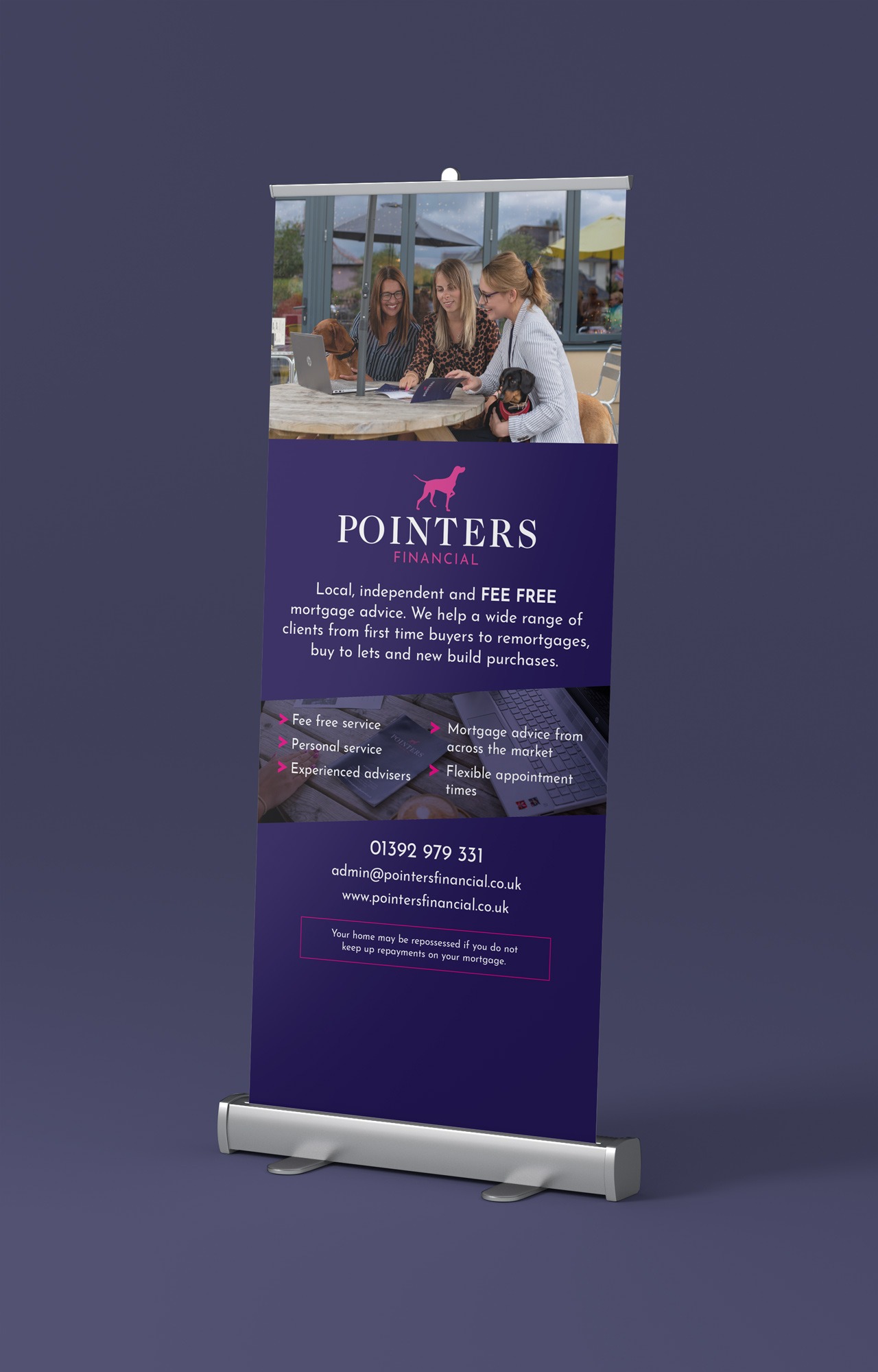
We were given the opportunity to work with a forward-thinking and modern group of mortgage advisers who wanted to deliver a service that was fresh, personal and engaging. They also wanted the company to appear well-grounded to remove the impression of a brand new, inexperienced company.
the process
The group had settled on the name Pointers Financial, as they always aim to “point clients in the right direction”. The name can also be seen as a traditional surname which suggests the company has stood the test of time.
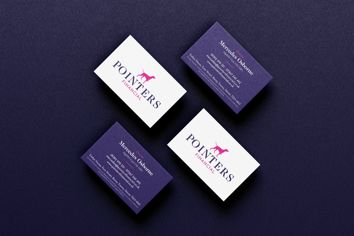
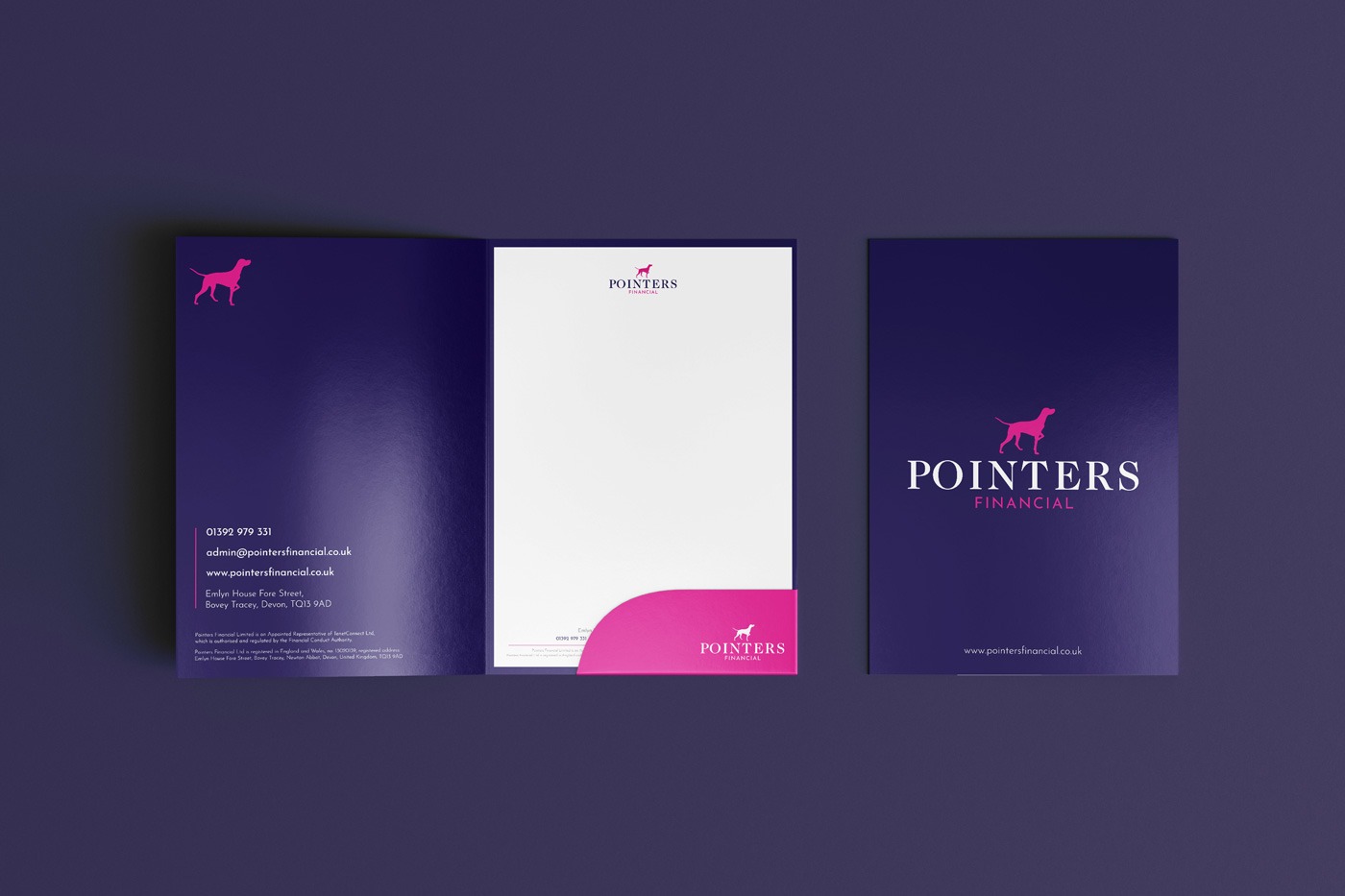
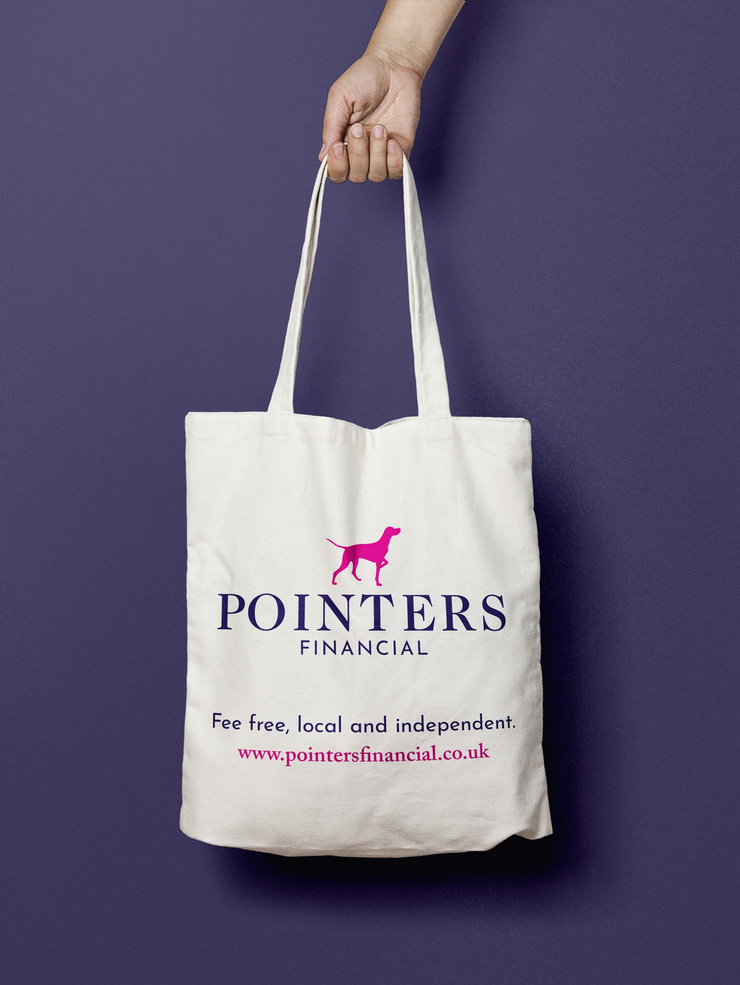
Our first task was to produce a brand and identity that would match their vision, personality and ethos. After various rounds of logo generation and refinement, we settled on a mark that represented a pointer hound, due to the idea of being man’s best friend, loyal and pointing their tails when they find game.
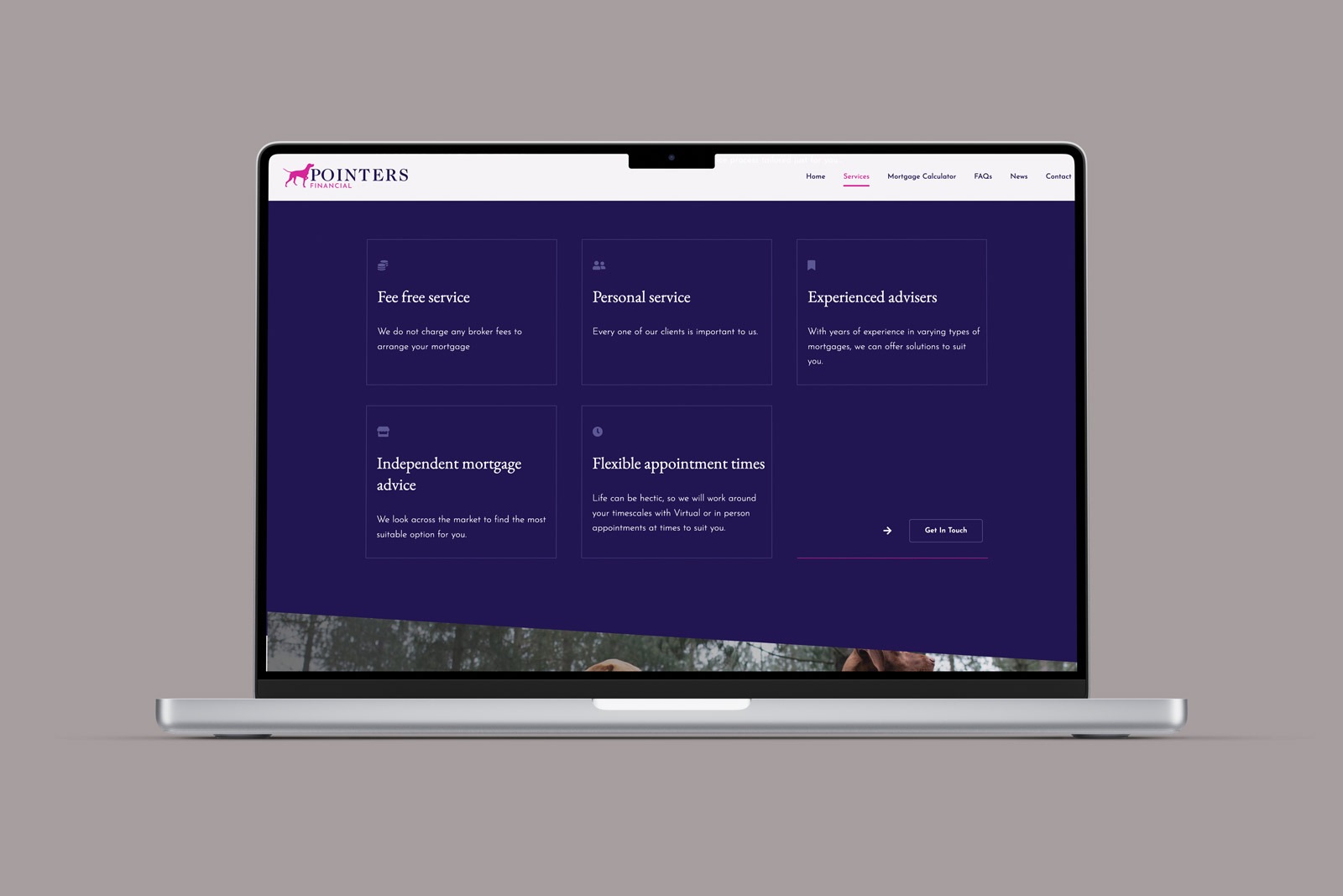
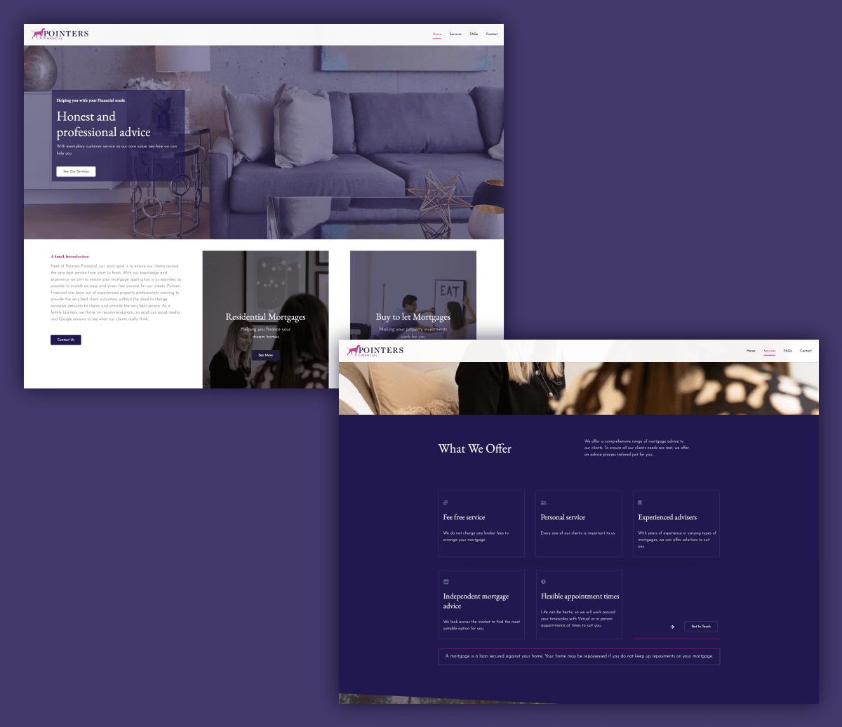
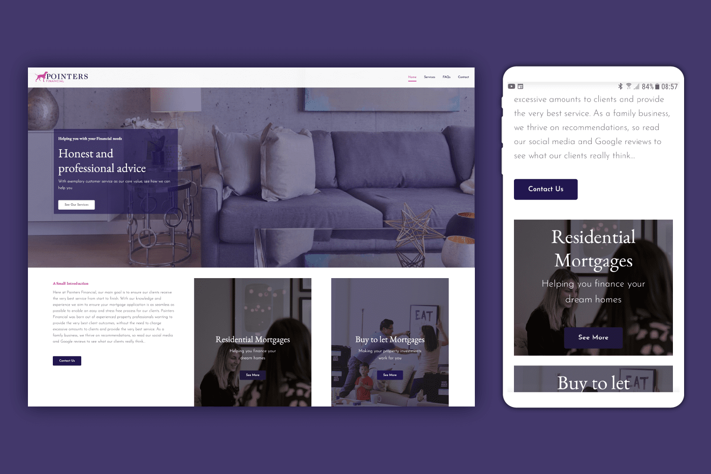
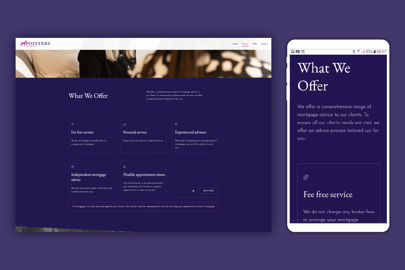
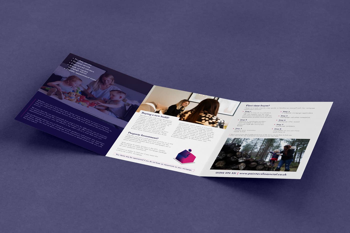
The mark was paired with two fonts to make up the logo. The heading text was placed in a serif typeface to help ground the identity and show tradition, while the subheading was placed in a modern sans-serif to provide contrast. These two typefaces were then adopted and used across the brand for the stationery and website.
A simple colour palette of Blue, Pink and white has been utilised across the brand to provide a clean and punch look and feel.

